Phương Reé
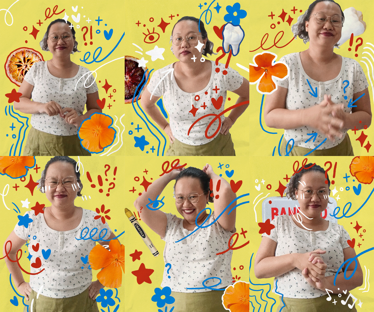
⭐ Designer and Artist based in Saigon, VN
⭐ RMIT University 2024' with 1.5+ YOE
⭐
Change is constant but my creative marks prove everlasting. I design by conducting experiments. But do not worry! Commercial viability is well within my capacity.
⭐
To me, I approach with a critical yet unconventional mindset. The goal is to preserve humanity as we evolve beyond our bodies' comprehension.
⭐
Individualism must coexist with community. And a world built for all, must be made from voices unheard.
⭐
Together, we can make massive impact. Let's explore new possibilities, where we will resist limitations!
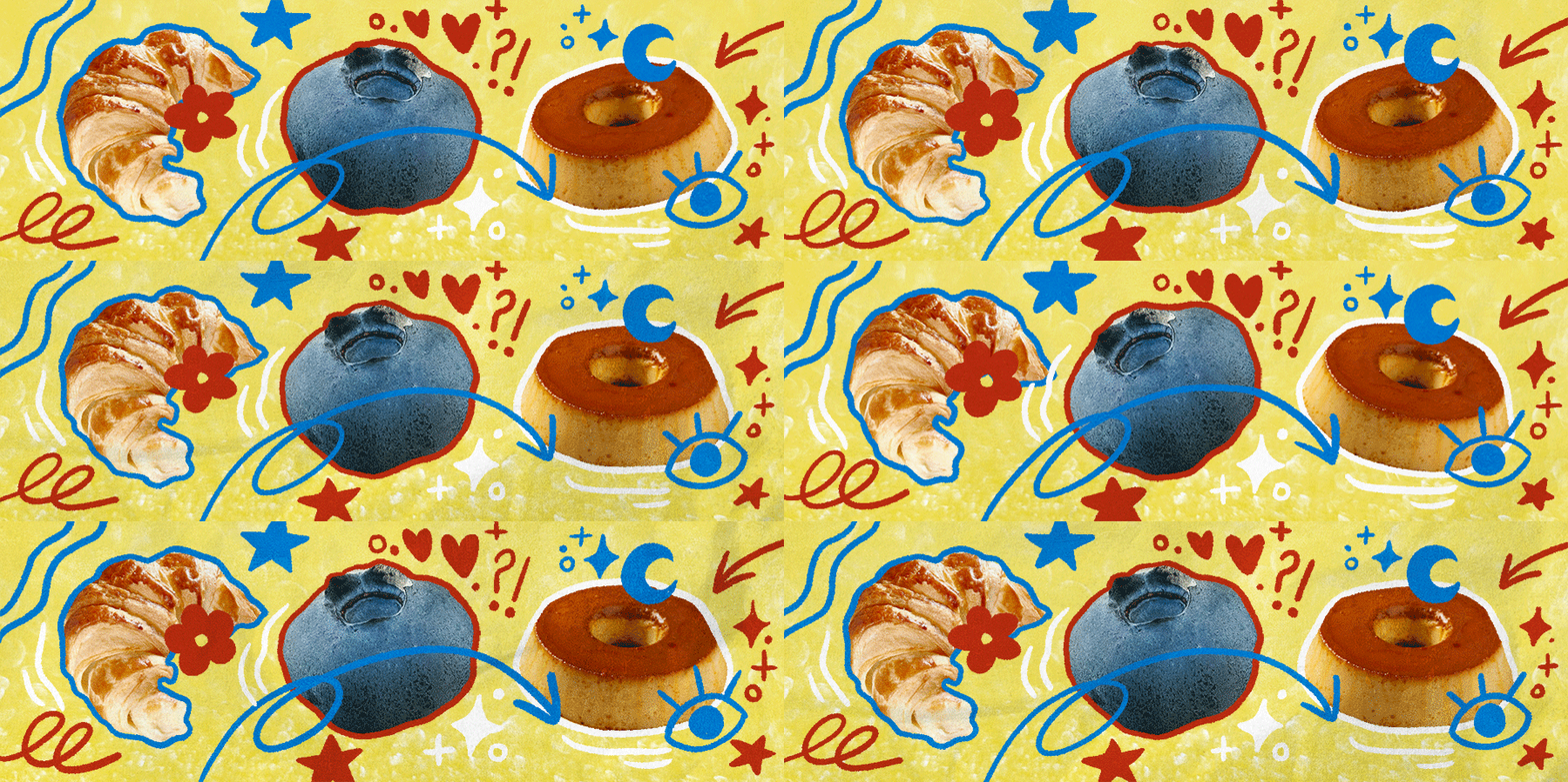
You might see traces of flaky, toasted croissants, blueberries and caramel flan in my works. Give me a story and I will make it come to life!
Deaf English
UXUI ⭐ Branding ⭐ University Work
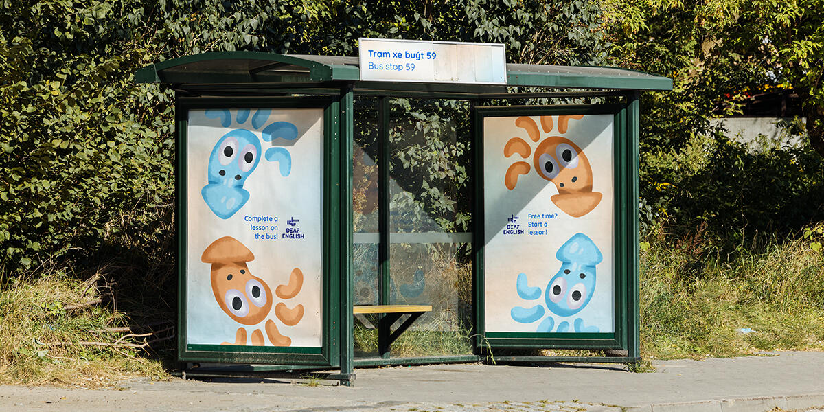
“Deaf English” is an English-learning application designed for the Deaf community in Vietnam. The idea came after spending time with people who are deaf or hard of hearing from all walks of life. Their main concern was accessible English-learning materials, as English fluency boosted employability. This project lasted for three months, comprising of experience, branding and marketing design. The application’s interface and visual communication were built on accessibility needs and linguistic psychology. When desigining the logo, my first iterations were bashed. However, it pushed me to be more daring. I learned to adapt critical feedback without losing artistic integrity. As the end result, “Deaf English” received a Distinction score (72/100) and praised for its branding and mission.
Global Viet Women
Branding ⭐ Professional Work
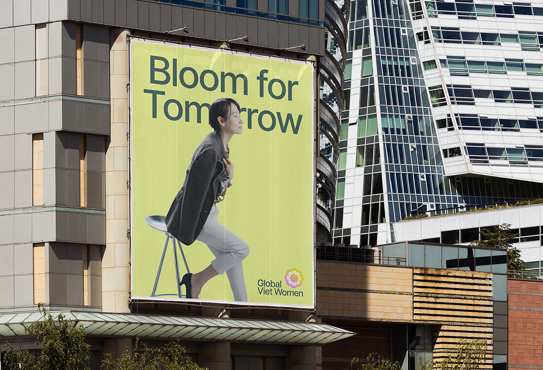
“Global Viet Women” is an international non-profit organization created for and by Vietnamese women. Their goal was to provide networking, advocacy, business and educational resources for Vietnamese women working domestically and abroad. This was my first full-scope branding project. Native Vietnamese flowers were chosen as key visuals, handled with an equally elegant and bold design language. Maintaining professionalism in this more creatively abstract brief was my strongest advantage. Since Project Pluto was a small studio, I took on project management, client presentation and communication alongside creative responsibilities as the lead designer.
Sua Chua Di Hai
Branding ⭐ Personal Project
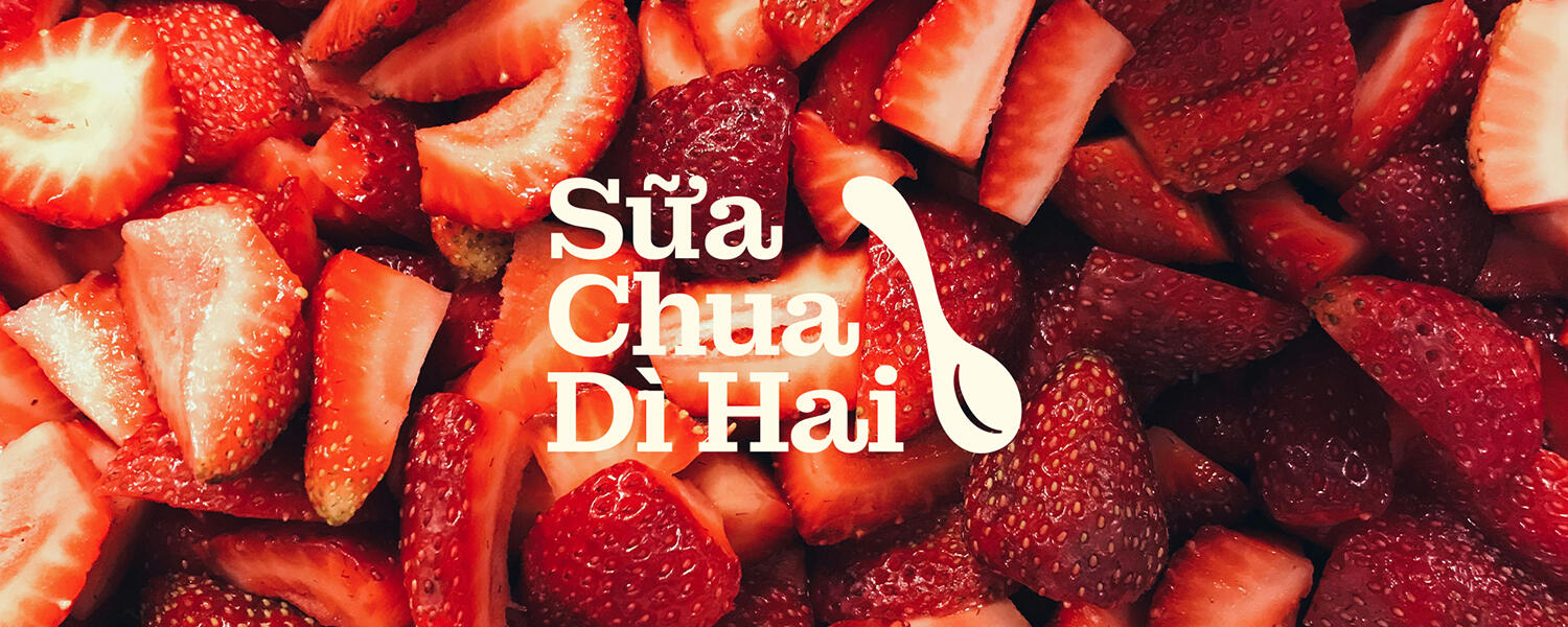
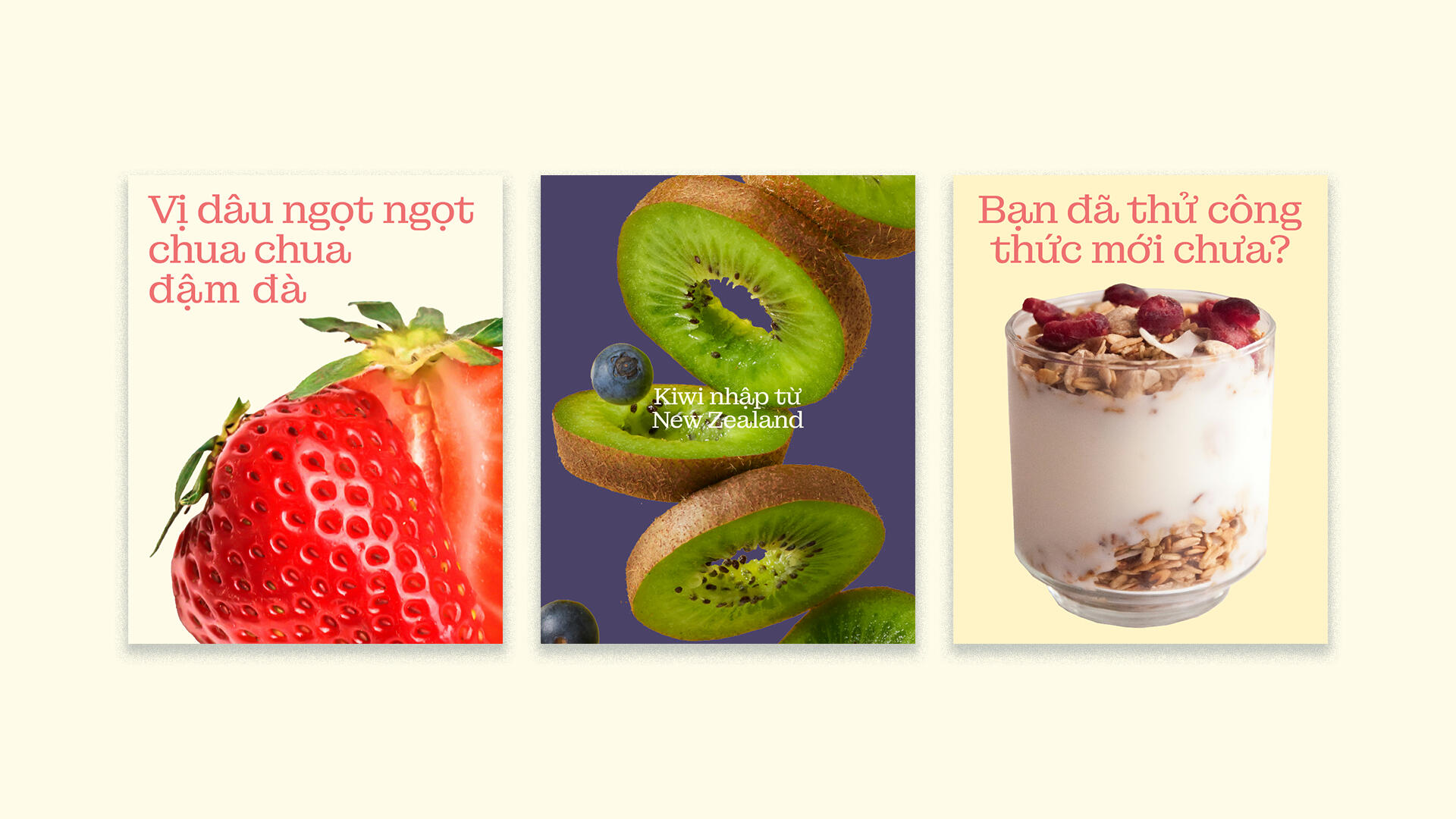
“Sua Chua Di Hai” (Aunty Hai’s Yogurt) came from a business idea of selling Vietnamese yogurt overseas, where this traditional yogurt-making style was unexplored. I was inspired by palm-sized, locally made yogurt bags, sweetened by condense milk and fruity jams. At the time, Vinamilk, Vietnam’s largest dairy company rebranded. The guidelines broke traditional dairy packaging trends in the country. It pushed my approach to be more unconventional. Hence, hand-drawn illutrations of Aunty Hai and the flavors remains the star of the show. Aunty Hai is based on my mother, who is the eldest and only daughter of four siblings. “Di Hai”, in Vietnamese, is a common nickname given to a woman of this role. This project combined my storytelling nature with heritage. With this project, I used branding design as a medium to narrate.
Memoirs
Book Cover Design ⭐ Personal Project
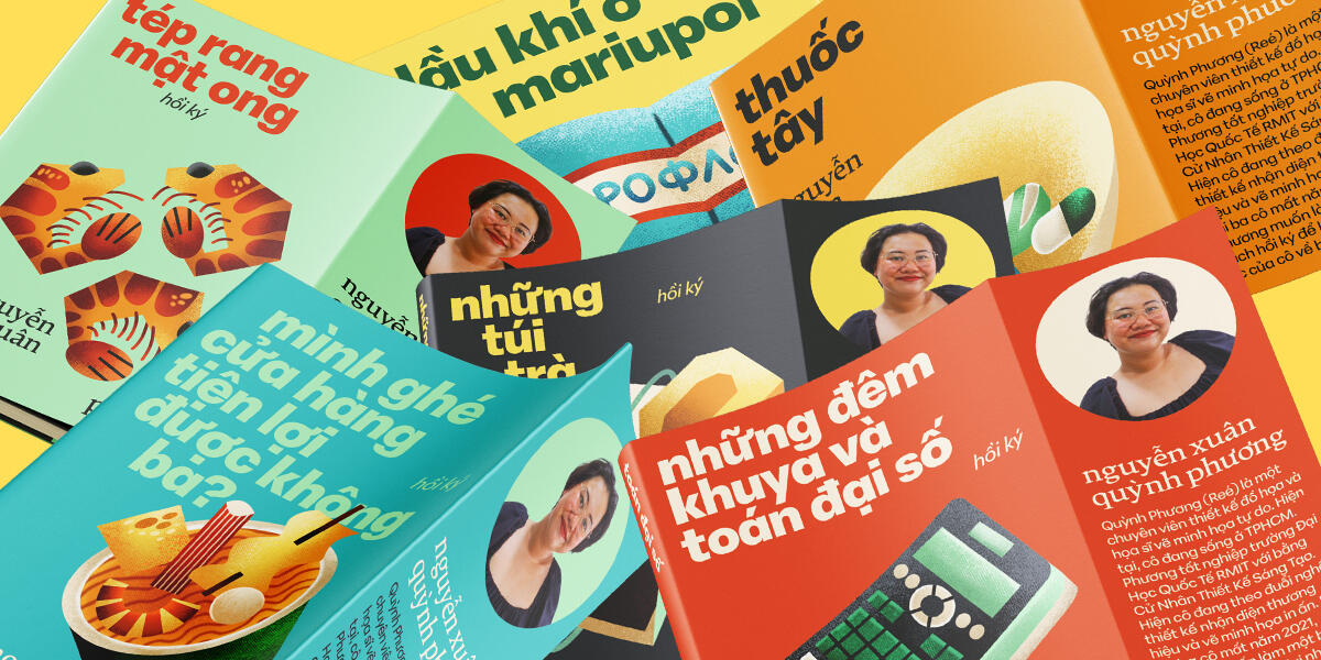
“Memoirs” is a heartfelt tribute to my father, who passed away in 2021 to the pandemic. Memories inhabited my mind and to prevent disintergration, I turned moments into pages. Each of these covers represent a core memory, which seemed insignificant in nature, but defined my childhood. The illustrations are jagged but gentle. Unnatural corners represent turbulence, but softness remains as our love sustained. I translated my mind into uncharted design languages, which were modernist typography, rasterising, and grainy bleeds. I learned to design in systems but break rules when it mattered.
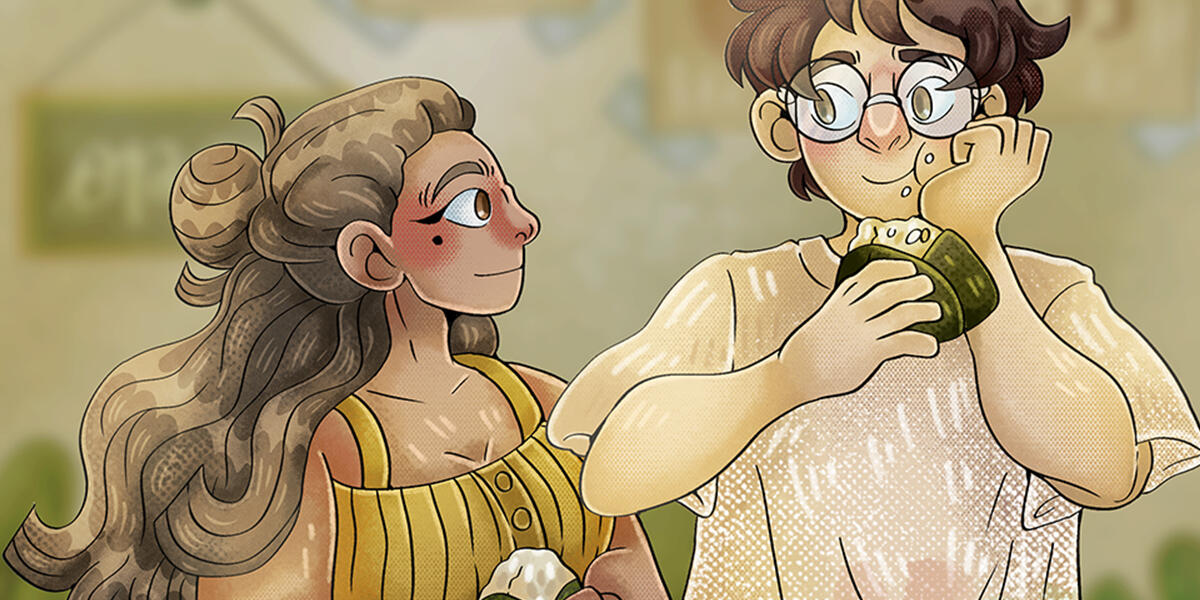
Chilies and Forests
Book Cover Illustration ⭐ Personal Project
“Chilies and Forests” is an illustrated book cover series with three variants. The story follows two high school seniors transitioning into adulthood. Toku, an athletic and outspoken student, works through phases of depression as she confronts angry outbursts. Minh-Anh learns to nurture human connections in pursuit of becoming a renowned artist. The story begins with a school fight and ends with a goodbye at Toronto International Airport. At the time of illustrating, a rough outline was completed. When researching contemporary literature book covers, I found fully contextualized scenes encapsulates the story’s essence and sparks the most intrigue. I experimented with visual textures, setting design and lighting to evoke nostalgia.
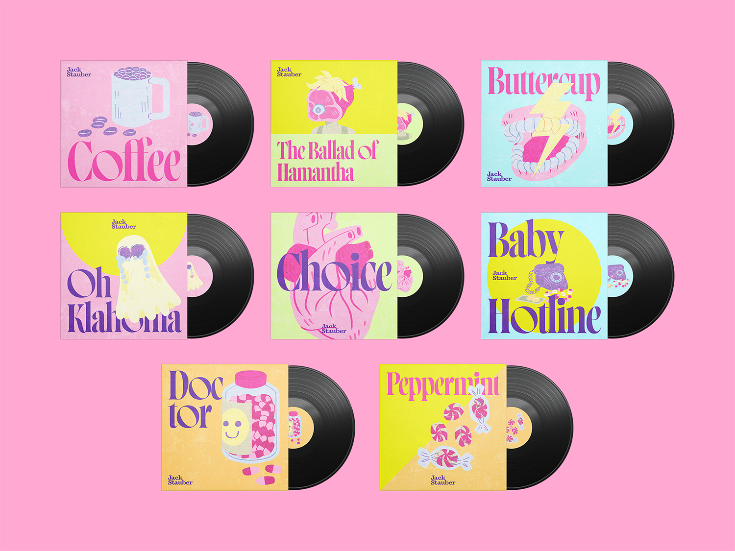
Jack Stauber
Album Cover Design ⭐ Personal Project
“Jack Stauber” encompasses eight album cover redesigns. The project started in 2022. I created CMYK, cartoonish illustrations to reflect Stauber’s strange visual language in his music videos, which blended nostalgia with eerie, analog reinterpretations. When presented to my lecturer, he pointed out my designs did not follow any established album cover guidelines. I was distraught and had shelved the project for two years. When I returned with some commercial experience, I reworked the covers to be representative of its genre while maintaining originality. My biggest takeaway was how modern typography can compliment hand-drawn illustrations, instead of clashing with its soft strokes.
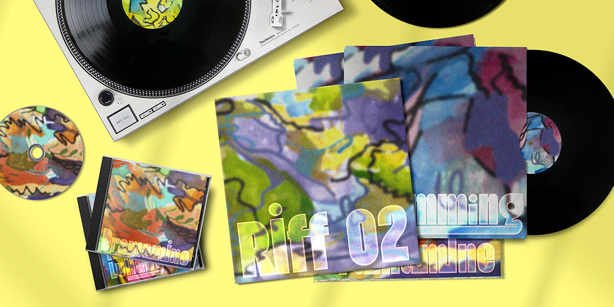
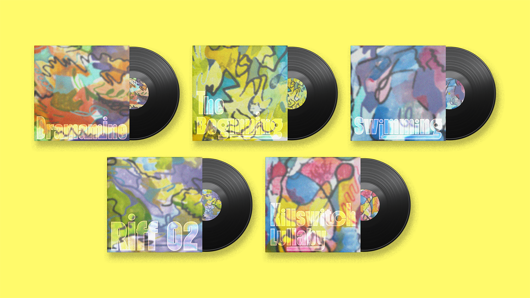
Flawed Mangoes
Album Cover Design ⭐ Personal Project
“Flawed Mangoes” reconnected me to why I pursued design. In 2024, I completed multiple commercial projects, which improved my professional skills, however, prevented me from self-expressive work and experimentation. While listening to Flawed Mangoes’ five best songs, I made haptic drawings, resulting in scratchy, uneven scribble lines, which I later on rendered with watercolor, gouache and alcohol markers. The final covers included retro-futuristic typography, a deliberate choice to distinguish from the electric instrumental genre. The project pushed me out of comfort, with excitement to try new mediums.
RMIT Orientation 2025
Key Visual ⭐ Marketing ⭐ Professional Work
For RMIT Orientation 2025, we were tasked with creating a new visual approach for back-to-school season, while adhering to the university’s brand. On-campus photography was transformed into paper cut-outs reminiscent of 2000s and 2010s student magazines. At the final stage, I incorporated geometric shapes and clean layouts to anchor RMIT’s professional voice.
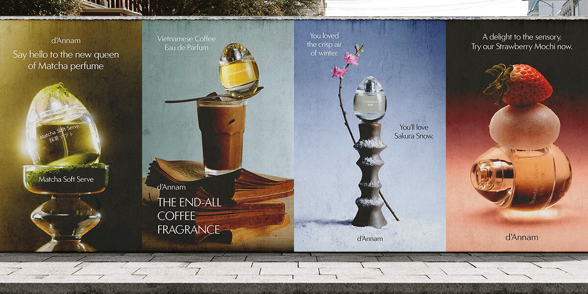
d'Annam
Advertising Design ⭐ Professional Work
At d’Annam, I created social media advertisements, worked with illustrators on packaging design, and refined internal brand guidelines. Our products were eau de parfums inspired by Asian heritage. I experimented with layout, copy, product photography and 3D renderings catering to different advertising campaigns. The most valueable skills I learned were working independently and managing creative projects beyond visual execution.
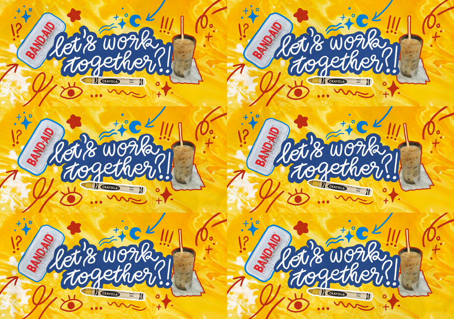
If you'd like to work with me, feel free to leave a note!


